Customize a plot
The SpikeInterface widgets are designed to have reasonable default
plotting options, but sometimes you’ll want to make adjustments to the
plots. The plotting functions all return a Widget object. These
contain and give you access to the underlying matplotlib figure and
axis, which you can apply any matplotlib machinery to. Let’s see how to
do this in an example, by first making some synthetic data and computing
extensions which can be used for plotting.
import spikeinterface.full as si
import matplotlib.pyplot as plt

recording, sorting = si.generate_ground_truth_recording(seed=1205)
sorting_analyzer = si.create_sorting_analyzer(sorting=sorting, recording=recording)
sorting_analyzer.compute({"random_spikes": {'seed': 1205}, "templates": {}, "unit_locations": {}})

unit_locations = sorting_analyzer.get_extension("unit_locations").get_data()
estimate_sparsity (no parallelization): 0%| | 0/10 [00:00<?, ?it/s]
estimate_templates_with_accumulator (no parallelization): 0%| | 0/10 [00:00<?, ?it/s]
Now we can plot the unit_locations and unit_templates using the
appropriate widgets (see the full list of
widgets
for more!). These functions output a Widget object. We’ll assign the
unit locations widget to fig_units.
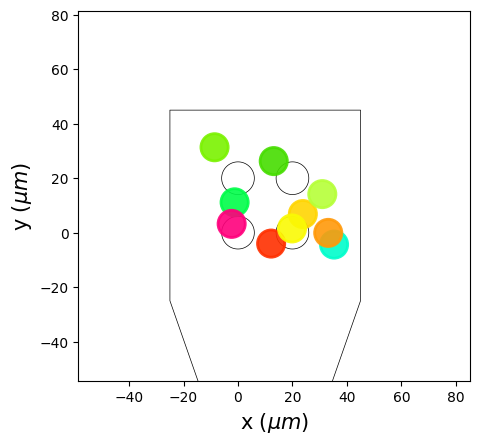
fig_units = si.plot_unit_locations(sorting_analyzer)

# Each widget contains a `matplotlib` figure and axis:
print(type(fig_units.figure))
print(type(fig_units.ax))
<class 'matplotlib.figure.Figure'>
<class 'matplotlib.axes._axes.Axes'>
By gaining access to the matplotlib objects, we are able to utilize the
full matplotlib machinery: adding custom titles, axis labels, ticks,
more plots etc. Let’s customize our unit locations plot. (Note: the
SpikeInterface Team does not endorse the following style
conventions):
# Get the widget
fig_units = si.plot_unit_locations(sorting_analyzer)

# Modify the widget's `axis`` to set the title and axes labels
fig_units.ax.set_title("My favorite units", fontname = "Comic Sans MS")
fig_units.ax.set_xlabel("x probe location (um)")
fig_units.ax.set_ylabel("y probe location (um)")

# You can also set custom ticks
fig_units.ax.set_xticks([-60,-30,unit_locations[0,0],30,60])
fig_units.ax.set_xticklabels([-60,-30,"unit_0_x",30,60])
fig_units.ax.set_yticks([-40,-20,0,unit_locations[0,1],40])
fig_units.ax.set_yticklabels([-40,-20,0,"unit_0_y",40])

# Change the limits of the plot
fig_units.ax.set_xlim((-30,50))
fig_units.ax.set_ylim((-50,50))

# And add extra information on the plot
fig_units.ax.text(unit_locations[6,0], unit_locations[6,1]+5, s="UNIT 6!!!", fontname="Courier")

fig_units
<spikeinterface.widgets.unit_locations.UnitLocationsWidget at 0x147a81520>
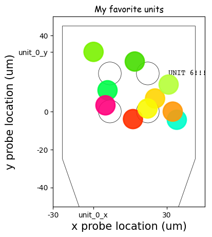
Beautiful!!!
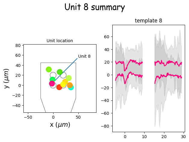
You can also combine figures into a multi-figure plot. The easiest way
to do this is to set up your figure and axes first, then tell
SpikeInterface which axes it should attach the widget plot to.
Here’s an example of making a unit summary plot.
import matplotlib.pyplot as plt
fig, axs = plt.subplots(ncols=2, nrows=1)

unit_id=8
si.plot_unit_locations(sorting_analyzer=sorting_analyzer, ax=axs[0])
si.plot_unit_templates(sorting_analyzer, axes=[axs[1]], unit_ids=[f'{unit_id}'])

axs[0].plot([unit_locations[8,0], unit_locations[8,0]+50], [unit_locations[8,1], unit_locations[8,1]+50])
axs[0].text(unit_locations[8,0]+52, unit_locations[8,1]+52, s=f"Unit {unit_id}")
axs[0].set_title("Unit location", fontsize=10)

fig.suptitle(f"Unit {unit_id} summary", fontfamily="Comic Sans MS", fontsize=20)

fig.tight_layout()
For more details on what you can do using matplotlib, check out their extensive documentation